Blue and Yellow, 12 stars, the map of Europe, the shape of a key: AEGEE’s logo is unique, represents European integration on several levels and is strongly recognisable. The logo that was approved at Agora Bonn in 1990. Since then, two major attempts were made to replace it. Both failed. The Golden Times looks back at the history of the AEGEE logos.
The first two logos
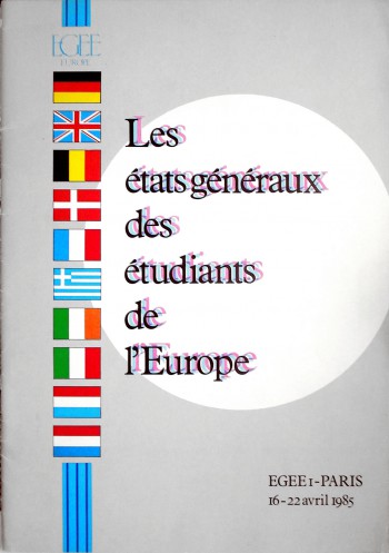
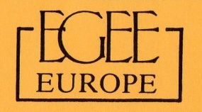
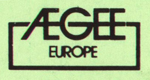
Everything started at the EGEE congress in April 1985, the founding event of AEGEE. The organisers around Franck Biancheri felt the need for a logo for the event. They made a simple one: the four letters of the event, slim and tall (see photo 1). This first logo stayed in use until 1988 (see photo 2), until EGEE changed its name to AEGEE, because another, older association used already this name. In the new logo massive letters replaced the fine and tall ones – and the A was added, but merged it with the A. It was just added as necessary evil, so it didn’t get much own space (see photo 3).
The locals make their own logos

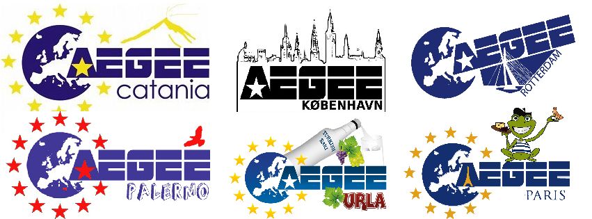
The network was growing, and with the number of locals also the number of individual antenna logos. Many antennae wanted to make own logos, which represented their city better. They mainly did that by using historical buildings. AEGEE-Berlin added the Brandenburg gate, AEGEE-Athina a Greek temple. Churches were especially popular: AEGEE-Groningen, AEGEE-Freiburg and AEGEE-Utrecht added the most famous church of the city. Sticking to the original font and look of the logo played no role. AEGEE-Köln used the old AEGEE-Europe logo font, added the A, the Dome and the Rhine. AEGEE-Enschede’s logo looked like a recycle bin. AEGEE-Rennes, AEGEE-Stuttgart and AEGEE-Utrecht added 12 stars (see picture 4).
A one-time shot in 1990
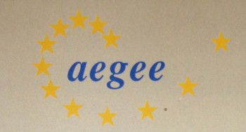
Many local logos were very creative, but all – including the official AEGEE-Europe logo – had one thing in common: technically, they looked improvised. Since modern PCs and graphic programmes became available, in 1990 the idea came up to create a better logo. Armin Knab from Karlsruhe, Secretary-General of AEGEE-Europe, developed one on his own for an image brochure of AEGEE in three languages, which was basically a predecessor to the Key to Europe yearbook. His Logo proposal featured the name AEGEE in small letters, with the 12 stars floating around (see picture 5). Armin: “In the time when we in Karlsruhe were working on the brochure, we were discussing a new logo in the CD. This logo was my proposal. Some month after the brochure was printed, we decided on a new proposal which was sketched by a Dutch graphic artist, the Logo which is also used today.”
A logo star is born
What Armin describes, is exactly what happened. CD member Michel Chatelin from AEGEE-Leiden presented a logo draft, which became the logo that we know today. It became immediately popular, because it was well crafted and had a very strong symbolism – with its map of Europe, the stars and the shape of a key. Because of it looks it was named “Key to Europe logo”. Very characteristic is its heavy font with a strong 80ies look. The font is called SF Sports Night Upright, you can download it here.
The new logo was first presented at the Presidents Meeting (EBM predecessor) in Karlsruhe in September 1990, at the Agora in Bonn two months later it became official. The Golden Times interviewed Michel Chatelin about the origin and meaning of the logo.
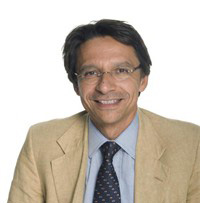
Golden Times: Michel, who created the AEGEE-Europe logo? Some people say it was developed for AEGEE-Leiden?
Michel Chatelin: When I was President of AEGEE-Leiden I was asked to join the CD by Achim Boers in 1990. AEGEE was growing fast also towards Eastern Europe after the Berlin Wall fell. I thought it was a good idea to have a single logo to create coherence and a common trademark. I asked a graphic artist from The Hague, Peter Wakum, to design the logo. If it wouldn’t have been adopted by the CD and the Agora I would have used it for AEGEE-Leiden because I did not like the existing logo at that time. So the logo was developed for AEGEE-Leiden and AEGEE-Europe and all antennae at the same time.
Golden Times: How did AEGEE perceive the fact that so many locals created own logos, different from the one that AEGEE-Europe used at that time?
Michel Chatelin: I put it on the agenda to strengthen the coherence of the network and to give AEGEE a common look and feel. Using so many different logos also made a chaotic impression you may say. It was also a time of historic change in the East-West relations.
Golden Times: Some people say that AEGEE-Leiden even used the new logo before AEGEE-Europe…
Michel Chatelin: The logo was made for both AEGEE-Leiden and AEGEE -Europe at the same time. Probably there were some months between the moment of implementation.
Golden Times: Were there other new logos seriously discussed or was the AEGEE-Leiden logo the clear favourite?
Michel Chatelin: I do not recall any alternative as everybody who saw it immediately liked it.
Golden Times: The logo is very symbolic, it has four different layers of meaning. Can you explain it?
Michel Chatelin: I spent many hours with the artist to explain what was AEGEE all about whilst he was making some sketches with a pencil. After a week or so I went to see the result and it was great. The logo indeed has different layers of meaning. The circle of stars refer to the fact that AEGEE is rooted in the European Community and its ideals. The map of Europe on the background refers to the fact that AEGEE is for all European students not only EU Member States. One of the stars breaks out from right to left referring to the East meeting the West. If a name is added to the logo it looks like a key. That is the key to Europe.
Golden Times: Was there resistance against the new logo? Or did the network meet it with great enthusiasm at the Presidents Meeting in Karlsruhe in September and the Agora Bonn in November 1990?
Michel Chatelin: There was no resistance. I had the logo printed in different colours on T-shirts and sweaters. Some of them with Leiden added, just to see how it looked like when localised. During the Presidents Meeting about ten people were wearing the logo which could not be avoided and caused a buzz. Before the PM we travelled through Europe to meet the key Presidents and I was carrying a small colour print of the logo on the side of a packet of cigarettes. During the PM I recall there was only some debate on the letter type and that the proposal to adopt the logo was supported almost unanimously.
Golden Times: The logo is still in use. What do you think about that?
Michel Chatelin: That is fantastic to see. It obviously served its purpose and still does.
Golden Times: Would you personally change it or do you think it’s still modern?
Michel Chatelin: I think it still looks surprisingly modern, or timeless. Changing it is not for me. I leave that to the actual members.
Golden Times: Anything else you’d like to add?
Michel Chatelin: Yes, the artist who designed it never was rewarded for it. I know he has a family with five children and a hard time making a living. It would be nice if he would receive some kind of appreciation from AEGEE.
18 years later…
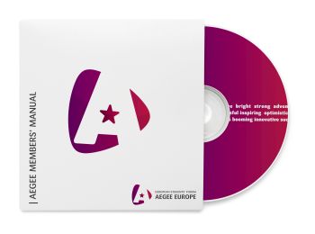
Indeed, the logo left a big impression on the members, because it took 18 years until finally a group of AEGEE members decided to present a new logo draft. This happened at the European Boards Meeting in Torino in February 2009. Responsible for the new design (see photo 6) was the CD of AEGEE-Europe President Dragan Stojanovski in cooperation with the Public Relations Working Group board. They did not just want to change the logo. They wanted to change the whole corporate design of AEGEE, including the AEGEE-Europe website, the use of colours and fonts and more.
However, this attempt to the change the logo failed. After Torino is was discussed in a very controversial way on the AEGEE mailing list. The criticism was very strong, some people even made fun of the logo by presenting parodistic alternatives. Ultimately it failed for several reasons:
– The people involved did not consult the whole network early enough, but developed the new design in a small team
– The new logo had no resemblance to the old one
– Many members simply liked the old logo, because for them it was part of the identity
– Especially some of the bigger locals opposed the change of a logo, because it would cause quite big costs.
In short: while AEGEE was still young and small in 1990, just a few year after its foundation, the fact that the logo of 1990 and AEGEE itself had developed a very strong tradition, made a change very hard, almost impossible.
Mastermind behind the new logo draft of 2009 was Bartek Kotowicz. The Golden Times asked the AEGEE-Gdansk President and Public Relations Working Group board member about that time.

Golden Times: Bartek, you worked on the reform of the AEGEE logo in 2008 and 2009. Why did you want to change the logo? What is so bad about it?
Bartek Kotowicz: I prefer to consider a logo as a part of brand, because talking only about the logo leads in many cases to useless discussions about visual topics. The brand is a powerful concept to make our organisation visible to our target group. The logo along with name, colours and typeface are those parts of brand which we see at first sight. They are on the top of the branding iceberg. As always in an iceberg model there is a huge base below the level of water. In branding we talk among other things about mission, vision, values, personality, target group and competition. All of them should be considered when we design a visual identity. Having this in mind I tend to think about the AEGEE logo as a meaningless composition of colours and shapes that are detached from today’s reality. We can like, love or simply hate it, while it’s extremely hard to assess what goals the logo and visual identity meet.
Golden Times: Who started the initiative and who was in the team beside you?
Bartek: Probably it was me, but I am not sure. The topic was very interesting for whole Public Relations Working Group’s Board, so it was included in the action plan for the PRWG. At that time we did not know yet what should be changed, there was only a strong will to examine the current situation. After several discussions with the CD and inside the board, the decision was made to establish a special group dedicated to the visual identity of AEGEE. Among the members were beside me: Robin Verschuren, Mateusz Zapart and Ramon Martinez. There was also a group of observers from the PRWG board, CD and others. The group was limited, because of lack of representatives of different AEGEE groups and bodies. Such bodies play a crucial role in branding or rebranding projects. They coordinate all works and should be a bridge between members, other stakeholders and the board. This is why the group should be as diverse as possible.
Golden Times: You did a lot of research. What did you find out about the use or misuse of the AEGEE logo?
Bartek: There was a giant mess regarding almost all aspects of visual and verbal communication in AEGEE – and I’m afraid that nothing changed since 2008 in this topic. First of all no one had an original logo, what makes it impossible to use it correctly. There was no precise information about the typeface and the official colours beside than “blue” and “yellow”. What’s more striking: there are no rules on the use of the logo. Practically nothing is standardised. This leads to the situation, which is for me unhealthy for an organisation and its visibility. We are having more than one hundred versions of a logo – there is one version per antenna and – what’s worse – even the CD used a few different types of the AEGEE-Europe logo. We are also using different versions of the antenna name in the logo.
Golden Times: When you did preliminary research, you also asked other student NGOs. Do they have better Corporate Design rules?
Bartek: We approached many European student organisations, for example ELSA, ESTIEM, EESTEC and ESN in order to get to know their branding practices. I can’t say if they are more professional than AEGEE in the field of brand building. I remember that some of them had strict rules regarding brand or visual identity while the other managed their corporate image in a flexible and unorganised way. There is though my favourite personal example in terms of brand management. This is ESN, which involved the well-known Dutch branding agency Koeweiden Postma in the rebranding process. Probably this is why the ESN brand image is in my opinion one of most visible, unique and coherent.
Golden Times: So how did you come up with the new AEGEE design proposal?
Bartek: We worked on several design proposals. The final one was firstly presented to the PRWG board and the CD and after that was published during the EBM Torino. This was a radical move. As radical as the changes that had taken place in Europe in the last 10, 15 years.
Golden Times: Why wasn’t it accepted?
Bartek: Two weeks ago I wrote an article for the Polish marketing magazine “Marketing in practice” on people’s reactions on changes in the field of visual and verbal identity. The main conclusion is that we as customers make simple judgments: like or dislike. This is because we are visualisers, hence the natural tendency to make assessments of all visual forms around us. These assessments are in many cases very negative, which is a normal part of the launching process of a brand image.
Golden Times: What can you do about it?
Bartek: We have to be aware and prepared for it. We can’t change them and it’s not our role. Our job is conducting the whole process as professional as possible. As you remember the visual system that we presented in 2009 caused groundswell of discontent. I believe that such negative reaction was because of some mistakes we did. The three main mistakes were the lack of a transparent of process, the lack of AEGEE members’ engagement in the process though consultations or polls and last but not least the lack of influential stakeholders in a coordination team. The last thing is really important, especially when the management of the organisation is not fully accepted by all members or workers as it was in my case. It’s also good to present visual changes along with strong facts and results of audits and researches, which are unable to be contested unlike used colours or shapes.
Golden Times: Now, four years later, what’s your opinion about the logo?
Bartek: The same as it was four years ago. The difference is that in 2009 I did’t like it mainly because of its look. Today I focus on strategic aspects of a brand. I don’t like it because I believe the logo does not represent AEGEE’s dynamism, freshness, openness and other important marketing factors.
2010 – the next reform attempt
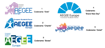
Half a year after this failed attempt, a new team of people tried a new approach to change AEGEE’s visual identity. They learnt their lessons from the failed attempt the year before. They asked for ideas in a very transparent process, involved the stakeholders of AEGEE at an early stage, there was a voting on several drafts, which were based on polls and consultations among all members (see picture 7).
As a result, CD Communications Director Michael Makowiecki, the driving force behind the new attempt, was confident to present a well-prepared proposal for a new visual identity for AEGEE to the autumn Agora in Istanbul, on 22nd of October 2010 (see picture 8).
At the Agora he presented the proposal like this: “The process started at the Autumn Agora Kyiv with a workshop, and after an event in Aachen we had four logos developed. Then we added another one. I wanted the network to choose the best one, so that you can identify with it. That’s why I did not want to propose one without the survey. The logo proposal Dots2 had a huge majority of the 1306 votes. So I was very confident to put it forward as the official logo proposal”, he stated on the Agora stage. Michal did not only present a logal, but also complex and detailed visual identity guidelines. An Agora prytannium discussed the logo controversial, regarding letters, transition period, colours and other aspects – and gave a positive recommendation to the delegates. However, there were also reservations, the same as last time: especially the costs for changing the old visual identity to the new one.
In the end 54.9 percent of the delegates voted in favour of the new logo, 40.1 percent voted against. 4.9 percent abstained. Since the logo proposal required a two-third majority, it was not approved. At the following Agora in Alicante in spring 2011 the CD made another attempt, but also this time not enough people voted in favour.
The chaos continues
It is unknown whether there will be another attempt to create a new logo. Michael Makowiecki made everything right: the logo looked more like a reform of the old one and not a revolution, the process was transparent, he involved the network and stakeholders. It will be hard to come up with a better idea and process.
Meanwhile the chaos continues (see picture 9). Some antennae use the logo without stars, some add buildings to it like in the old times, many ignore the colours yellow and blue.
However, it might not stay like that. “The chaos will not continue. The Visual Identity Manual is in the last phase of development. In February we will start testing it and implement it!” says Pavel Zbornik, European Institutions and Communications Director in the CD. Mediation Commission member Maurits Korse, who is also involved in creating the Visual Identity Manual, gives a bit of insight: “For example, it will be possible to make the logo monochromatic in one of the colours defined in the Manual. So it can be only blue, or only yellow, red, green or any other colour which will be adapted in the end. Also there is the idea to implement a small area above the EGEE letters for local customisation. These costumisations should however follow some rules to keep things coherent and representative throughout the network.”
Related Posts
1st August 2019
The Gallery of All Presidents of AEGEE-Europe
Here is the gallery of all Presidents of AEGEE-Europe - with photos of every one of them. Enjoy the list!
